SPD
sport project development
es/
_________________________
Brief
S.P.D. nace de la iniciativa de varios profesionales que aportan una dilatada experiencia en el diseño y desarrollo de distintas soluciones deportivas, creando un servicio adaptado y de alta calidad para sus clientes.
El centro de su actividad son sus clientes, de esta manera la expectativa de servicio adquiere un reto para ellos y un nuevo significado para sus clientes.
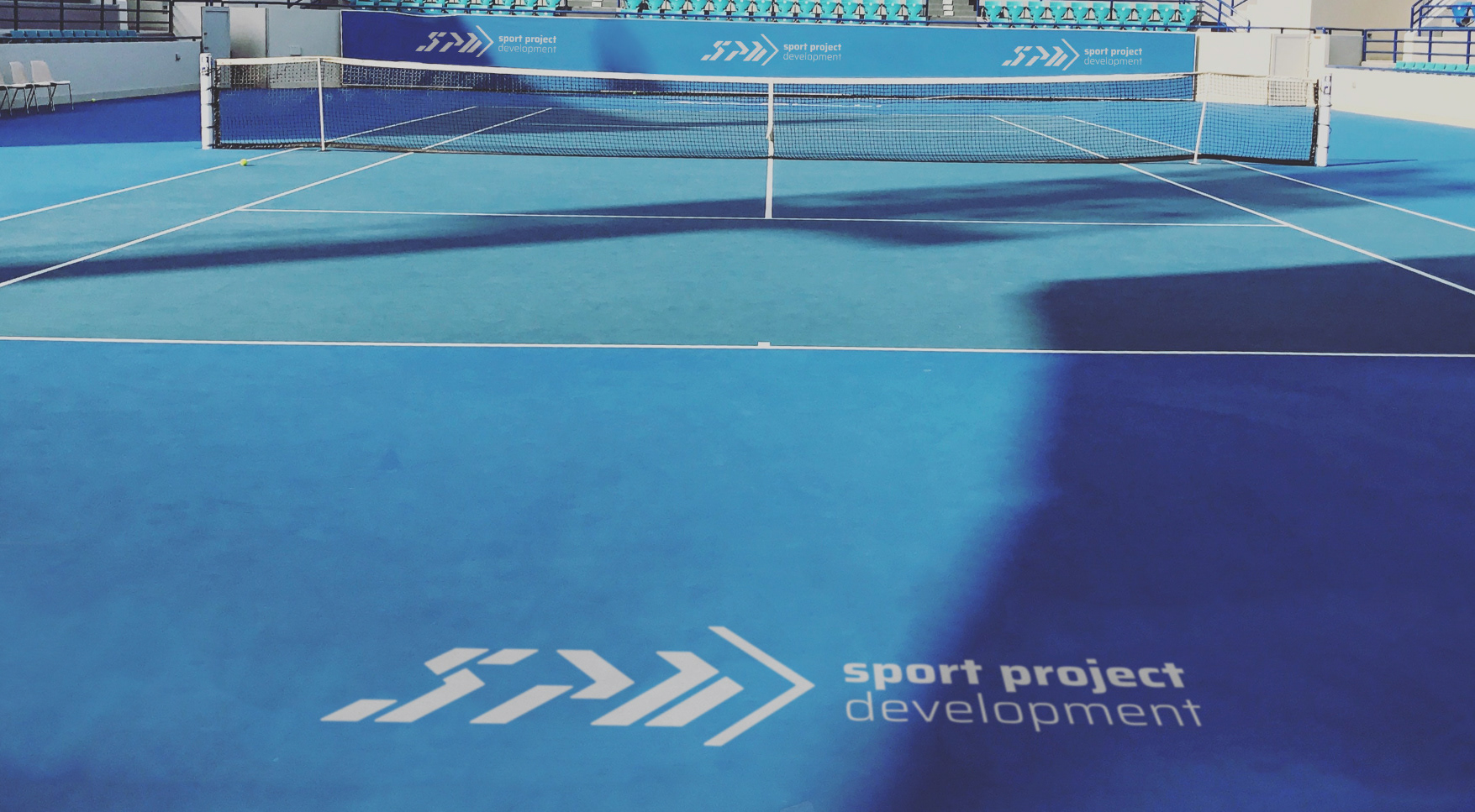
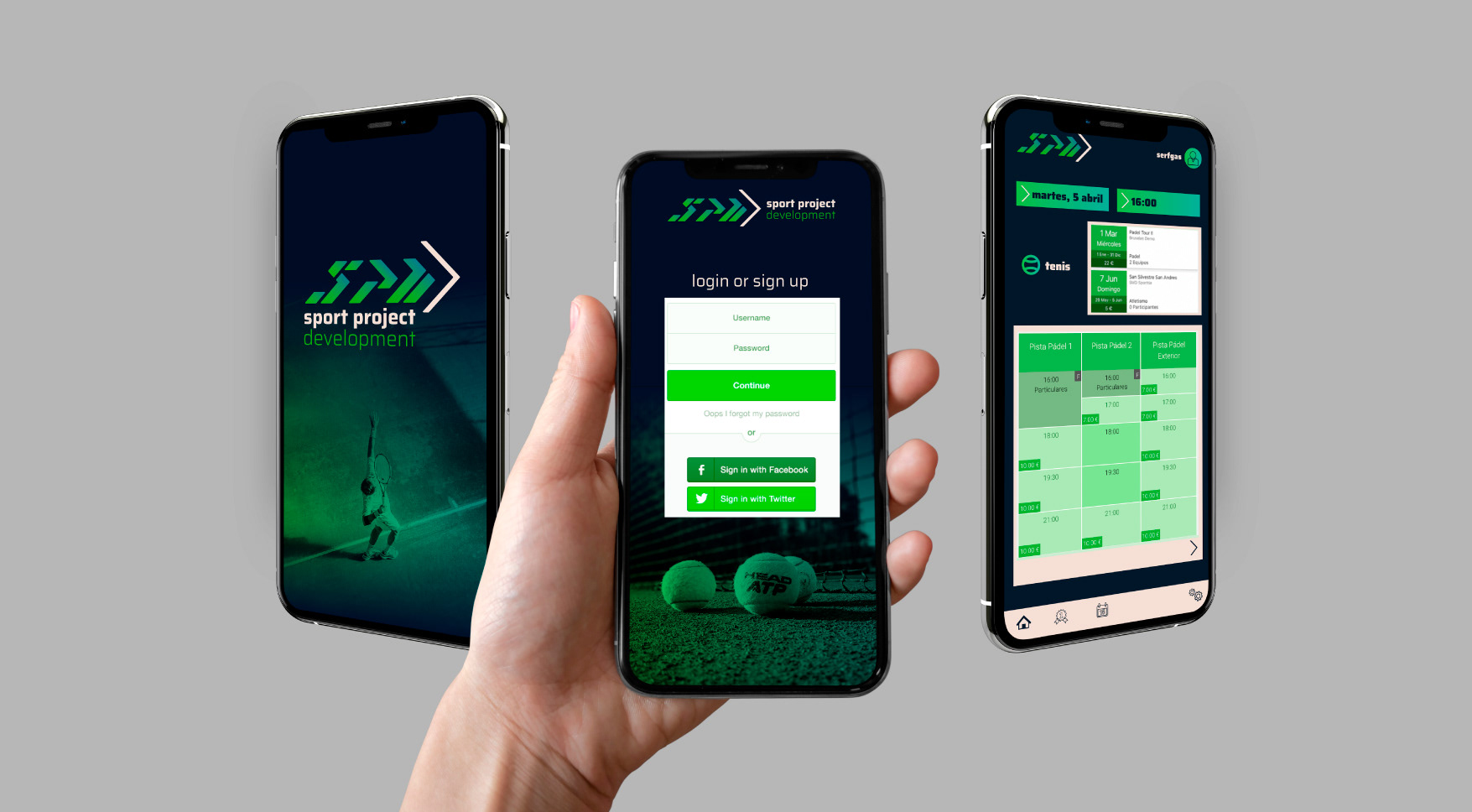
Es una empresa deportiva que engloba varios ámbitos, la formación, la gestión de espacios deportivos, el alquiler de pistas, por tanto la marca debe adaptarse a varios entornos, tanto offline como online.
Identidad Visual
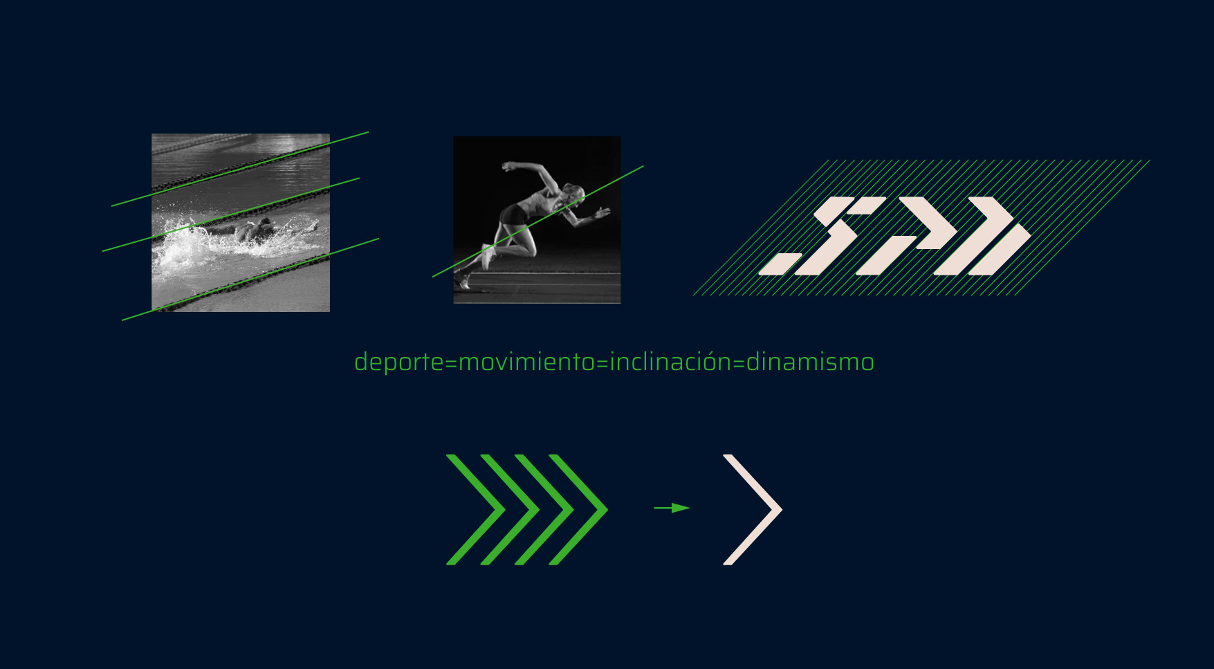
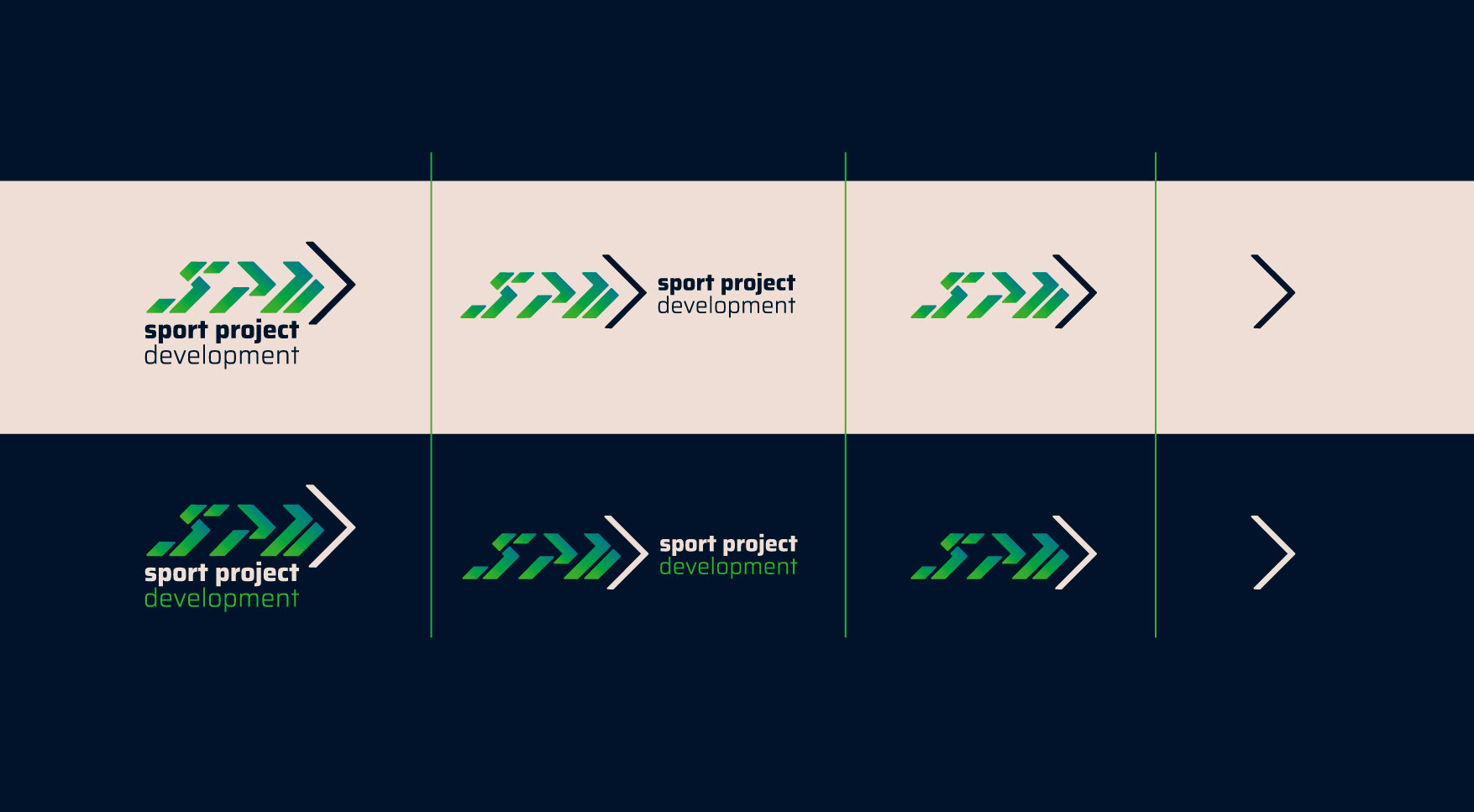
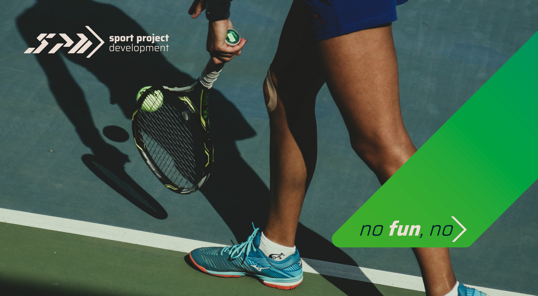
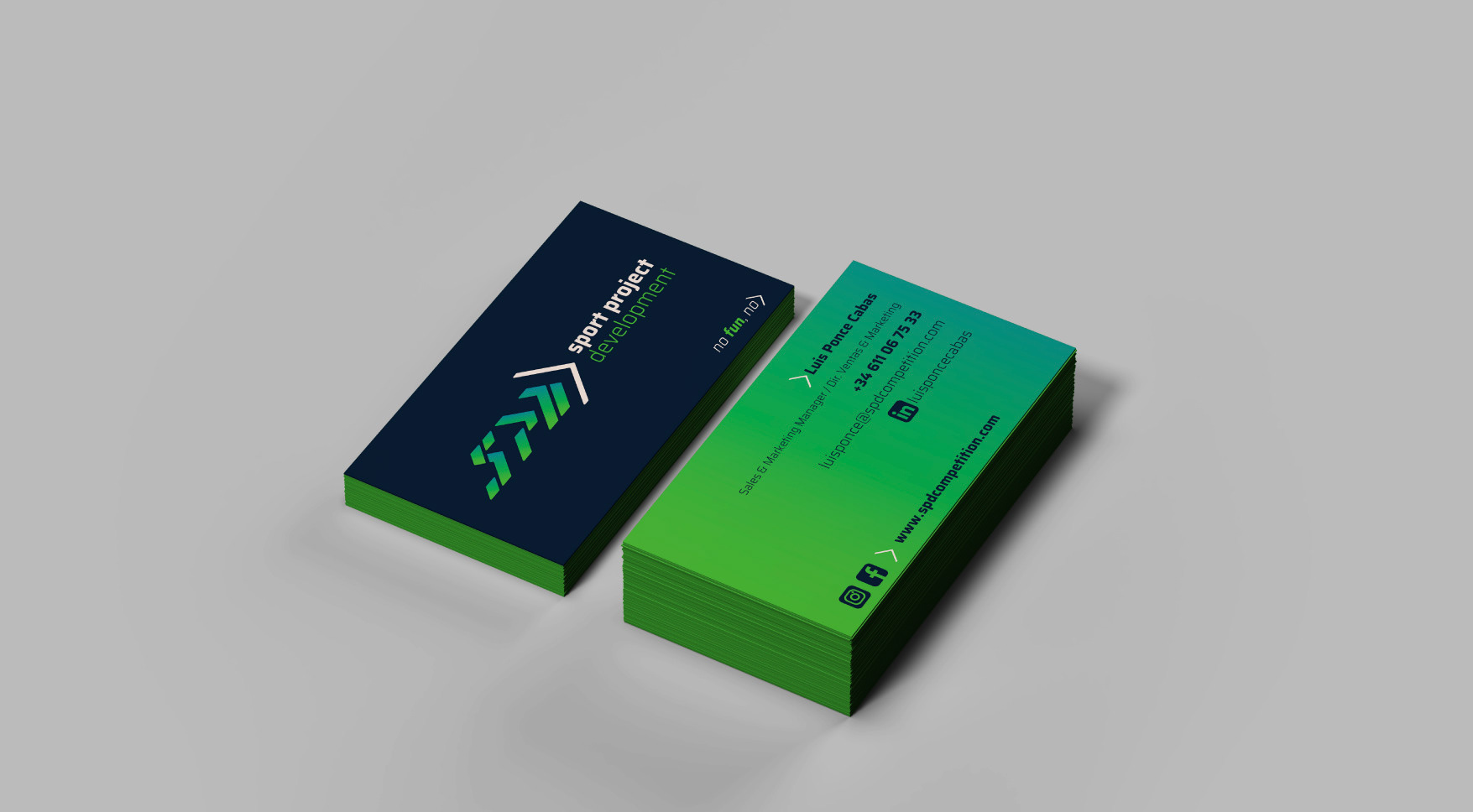
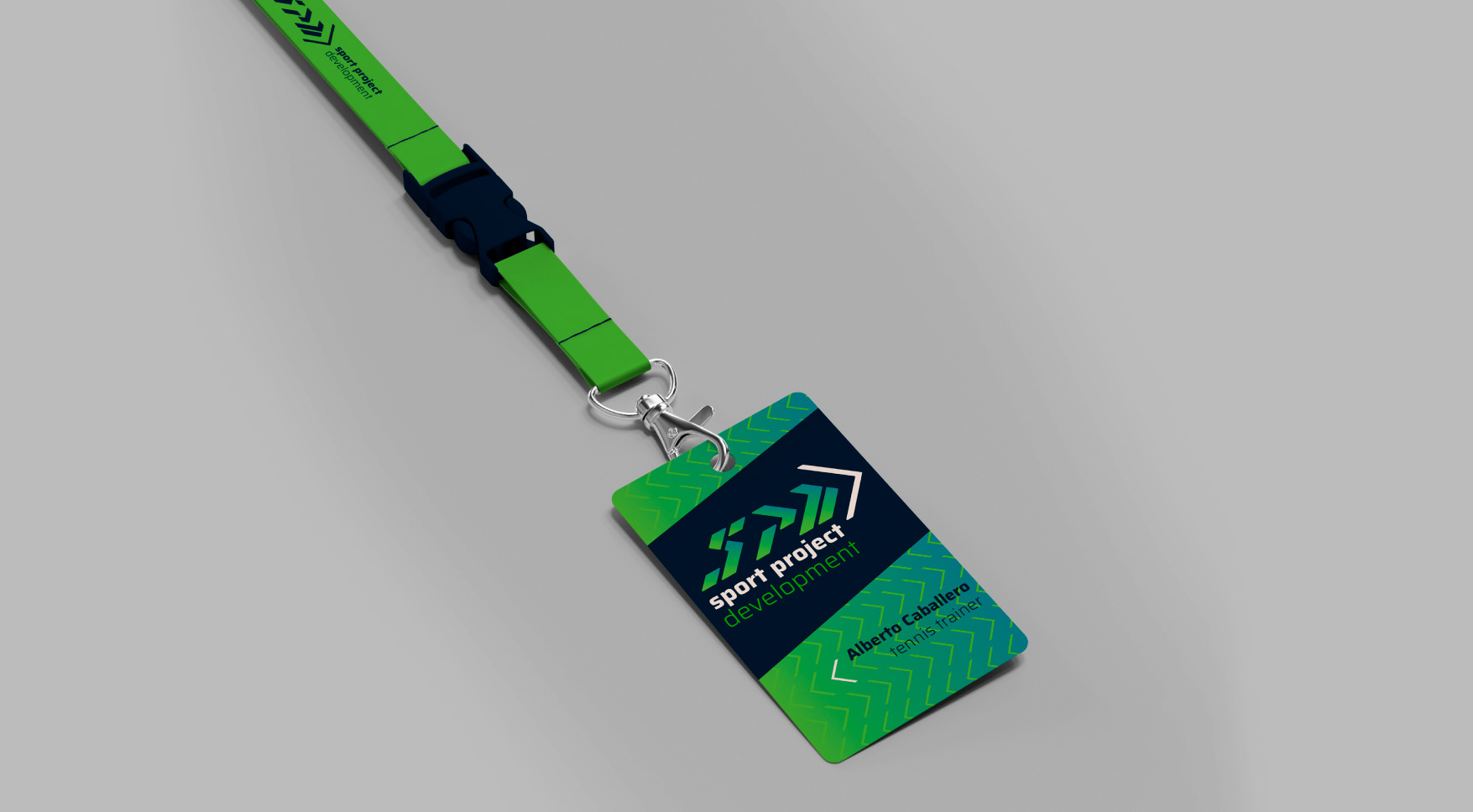
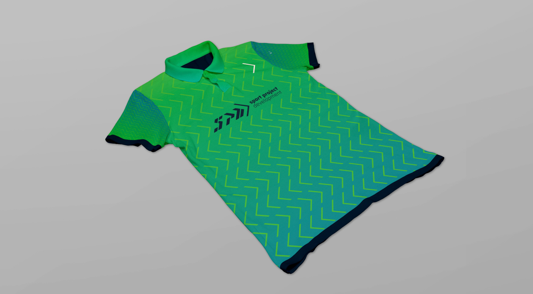
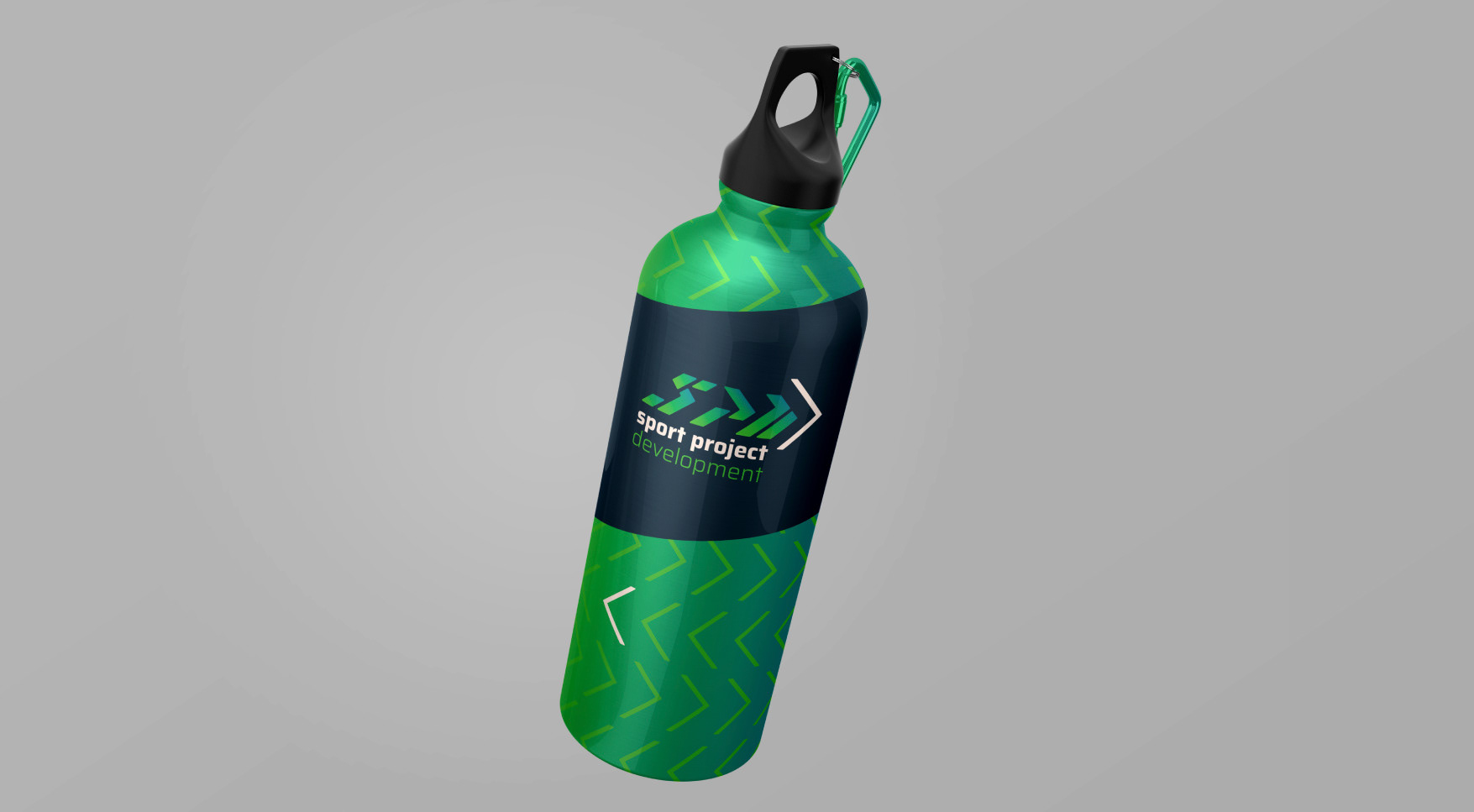
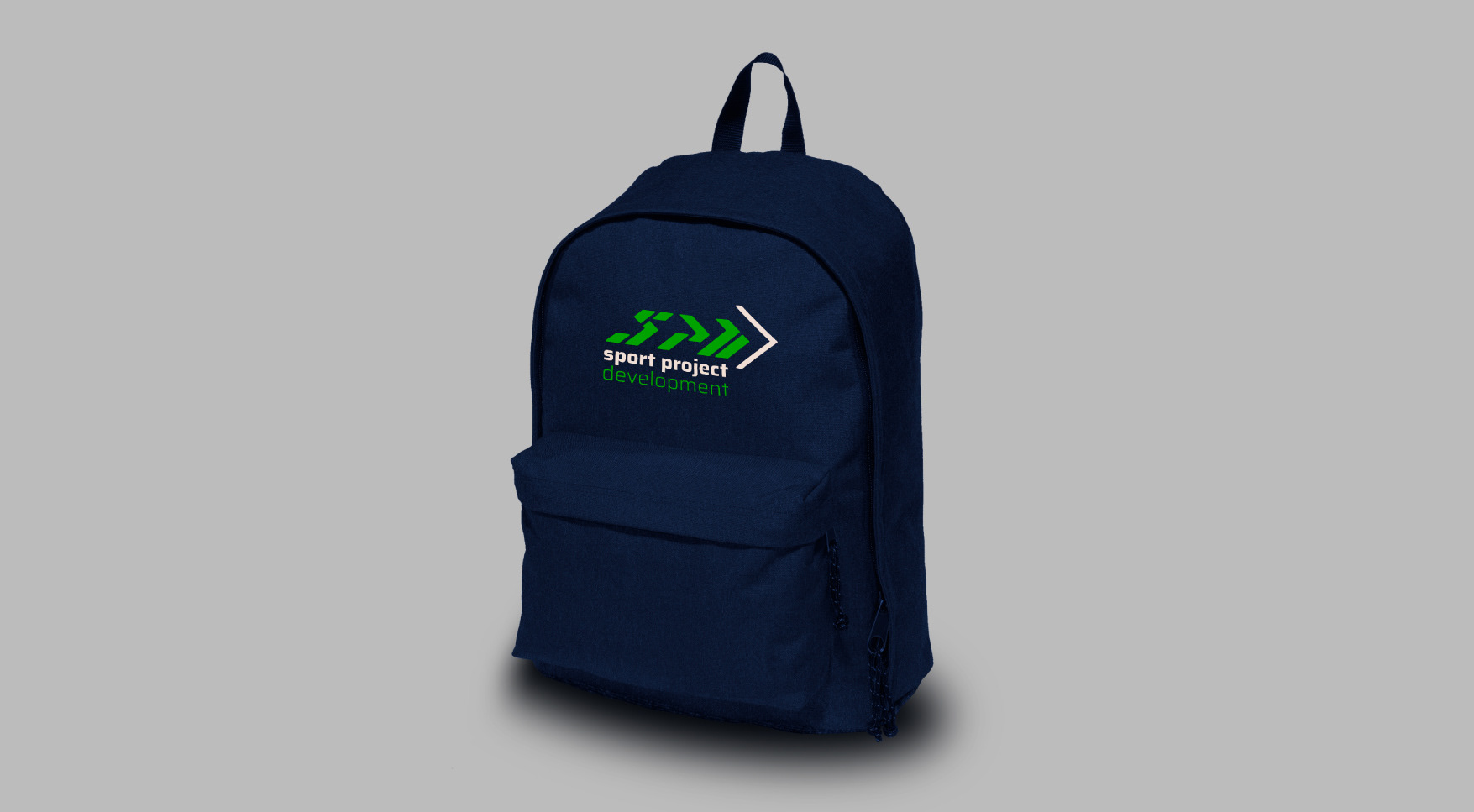
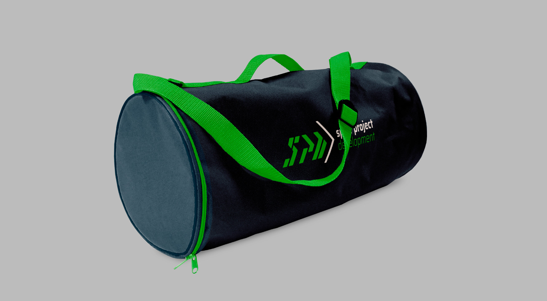
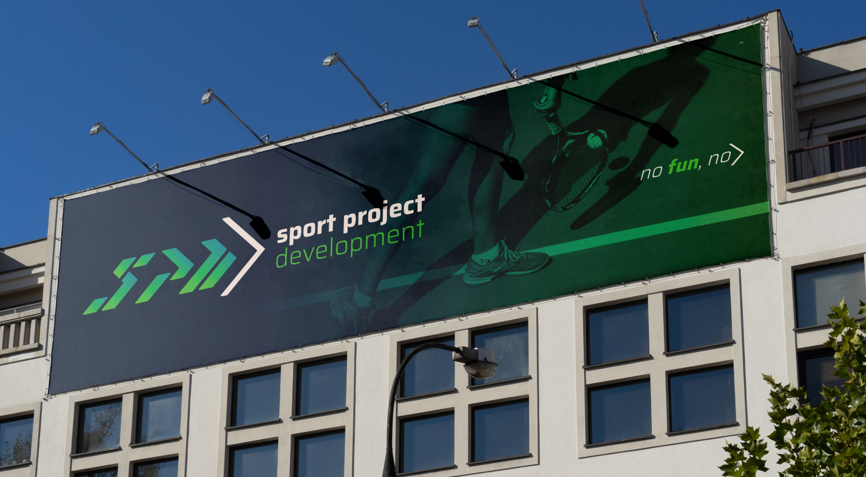
Para visualizar la idea a de la marca, nos centramos en la “inclinación” y “flechas” que indican movimiento y dinamismo, la “flecha” es el símbolo conector que servida para crear otros logotipos asociados a la marca, ya sea en su vertiente de formación como en la gestión de instalaciones deportivas.
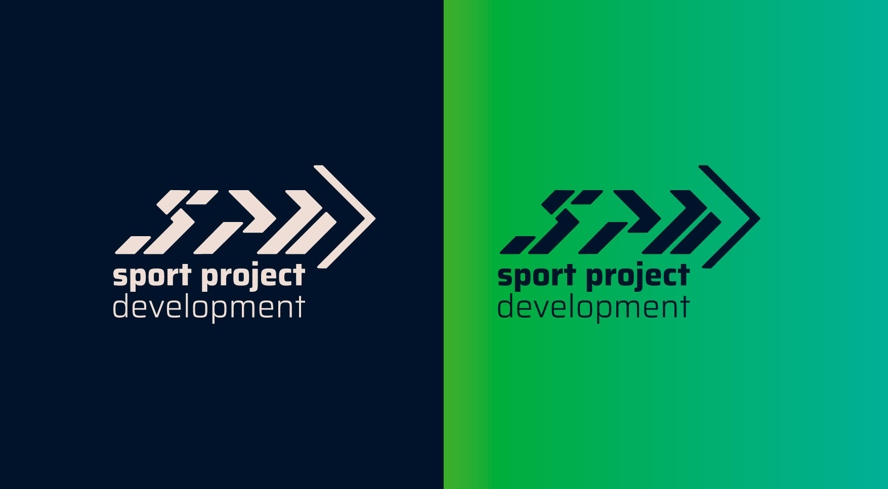
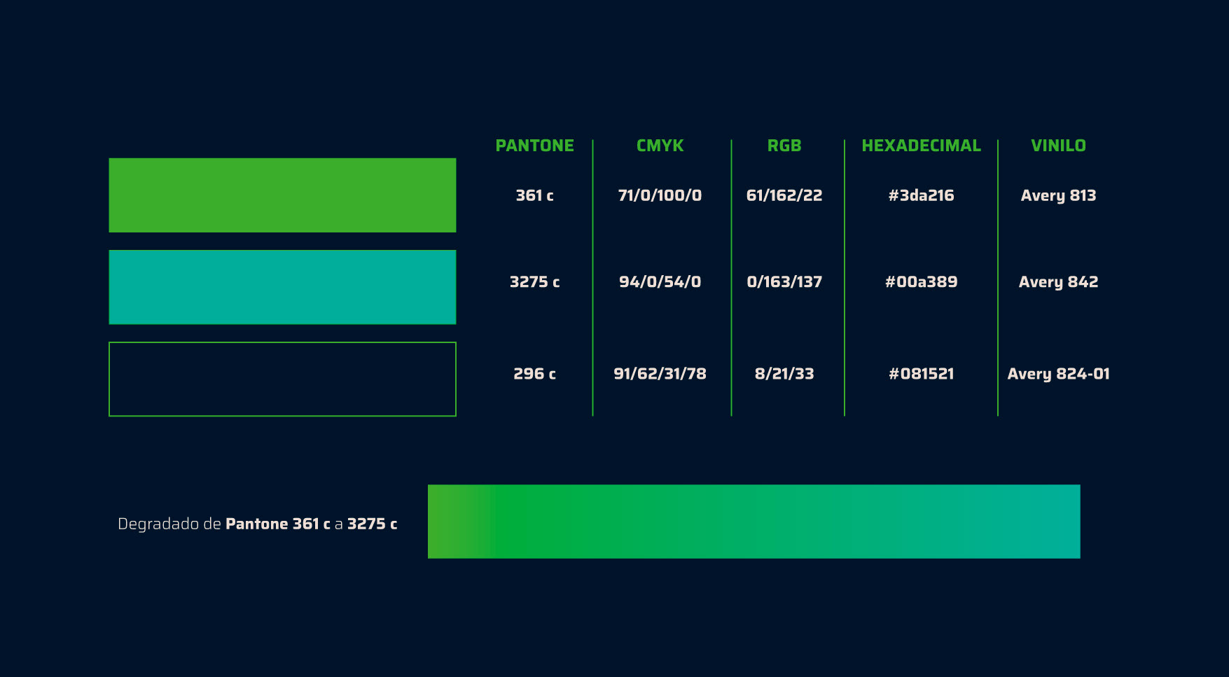
En cuanto a los colores se elige un azul oscuro que aporta seriedad, compromiso, orden y una degradado de azul a turquesa que dota al logo de equilibrio, un toque de modernidad y dinamismo.
_________________________
en/
_________________________
Brief
S.P.D. was born from the initiative of several professionals who bring an extensive experience in the design and development of different sports solutions, creating an adapted and high quality service for their customers.
The focus of their activity is their customers, so the expectation of service acquires a challenge for them and a new meaning for their customers.
It is a sports company that encompasses several areas, training, management of sports spaces, the rental of tracks, therefore the brand must adapt to various environments, both offline and online.
Visual Identity
To visualize the idea a of the brand, we focus on the "inclination" and "arrows" that indicate movement and dynamism, the "arrow" is the connector symbol that served to create other logos associated with the brand, either in its training aspect or in the management of sports facilities.
As for the colors, we choose a dark blue that brings seriousness, commitment, order and a gradient from blue to turquoise that gives the logo balance, a touch of modernity and dynamism.
_________________________